You have implemented Scrum with some of your teams and get the following question – “How do we report project status to management?“.
If your organization is like most organizations, your choices are:
- You ask someone (the Scrum Master or the Project Manager) to convert (translate?) the information the team uses into the traditional management reports;
- You present the information exactly the same way the team is using it;
- You find a way to bridge the new reporting to the old reporting in order to reduce re-work.
If you have selected option #1, this post won’t help you much since there is no way for me to know what the traditional information reporting mechanism is within your organization.
If you selected option #2, you don’t need to read this post since you only need to show the information you already have compiled on its current form.
But if you went with option #3, you’re in luck. Well, kinda. My colleagues Mathieu and Elsa have come up with what they call, the SunSet graph [French] – because of its colorful presentation.
The Sprint Burn Down Chart
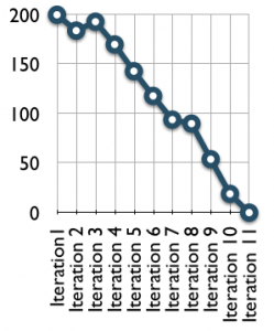
At the team level, many Scrum teams rely on the Sprint Burn Down chart. The Burn Down is very useful to present the amount of work remaining within the sprint in light of the time remaining. In addition, the Sprint Burn Down has the benefit of presenting true progress by comparison to a baseline in order to determine the team’s ability to meet the sprint timeline.
The Release Burn Down Chart
At a project level, a Release Burn Down chart can be used and is very useful for managers and people around the project to appreciate project progress as it presents actual progress in light of a project baseline. Just like the sprint burn down, the project burn down is a very visual way to present the amount of work remaining with regards to the amount of time left.
The SunSet Graph
The SunSet graph is a great complement to the other “Scrum” reports and is also geared toward management – although the team also benefits from producing it and having visibility to the information.
Just like the burn down charts, the Sunset graph gives visibility to the progress of the project – what is scheduled to be completed with regards to a baseline taking into consideration the estimated efforts by the team. With the associated product backlog, the sunset graph gives complete visibility to the content of the project. In addition to the Sunset graph, a financial graph can be added to give a one-view perspective of the project to managers interested in following the progress of the project.
The SunSet graph divides the user stories into 3 categories: Optional, Important, Mandatory. In a quick look, managers can easily follow the progress of the team in light of their commitment to deliver the stories based on the team’s velocity. Before the first Sprint, the team plots the number of sprints planned for the project (x-axis), the number of points to be delivered (y-axis), and the forecasted velocity.
At the end of each sprint, the team plots its progress by entering the number of stories completed and by adjusting their velocity based on actual numbers. The SunSet Graph Template can be downloaded.
 The content of the template is updated at the end of each Sprint. Below, the SunSet graph after 6 sprints.
The content of the template is updated at the end of each Sprint. Below, the SunSet graph after 9 sprints.
The content of the template is updated at the end of each Sprint. Below, the SunSet graph after 12 sprints.
The content of the template is updated at the end of each Sprint. Below, the SunSet graph after 15 sprints.
By using a visual presentation of the project progress. It becomes easier for managers to understand at a high level the issues encountered by the team. Managers can then focus on anticipating potential budget excess or non-delivery of mandatory stories as opposed to focusing on the content of the project. In addition the keeping managers informed, the Sunset graph supports the concept of the self-organized team.










Recent Comments